Waites’ Cognizances of Newark
Photographs Courtesy of Newark Town Hall Museum
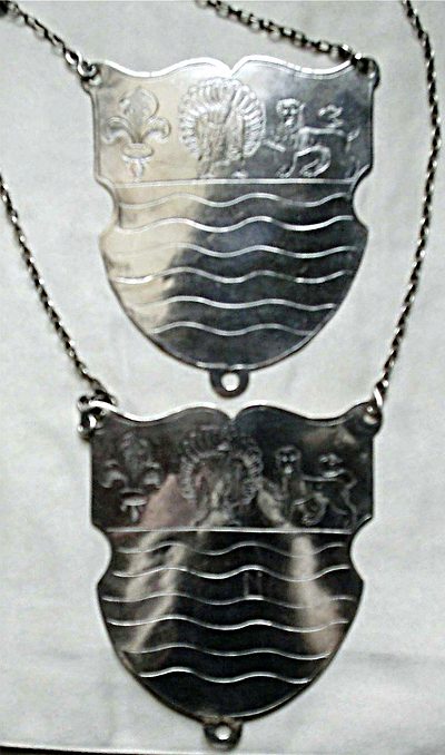 |  |
| Two Newark Waits’ Badges, obverse | |
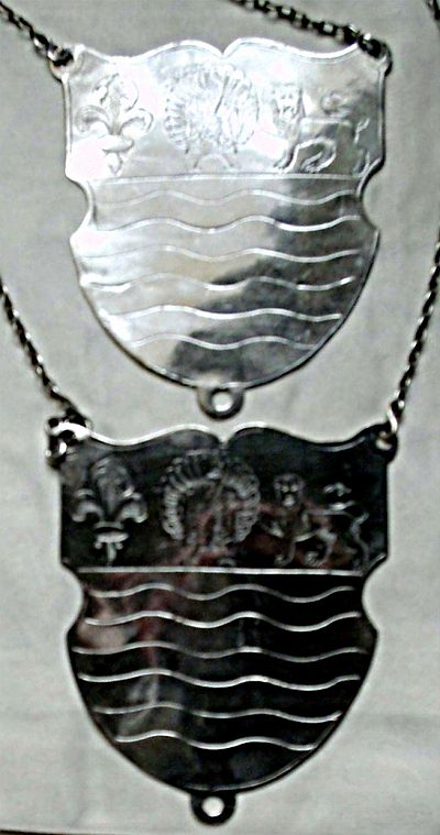
 | 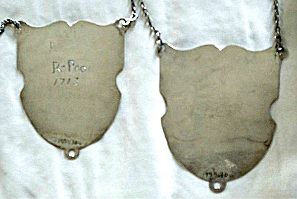 |
| Two Newark Waits’ Badges, reverse | |
 |
NOTES
Inscriptions on reverse of Newark Waits’ Badges.
The inscriptions appear beneath one-another. Most of inscriptions are very fine scratches, my camera wouldn’t pick them up. My naked eye didn’t do much better. Taken line by line, with my notes added:
FIRST BADGE:
Line 1:
“WI” The museum’s records say it is “WI”, but it could possibly be “WF” or “VVI”. Interestingly, the “I” is bisected by a third horizontal in the centre. This may not even be a letter at all. If you can help identify this symbol please contact Al Garrod
Line 2: “R”
Line 3: “R*P” in upright block letters – almost book-like in style. These letters, together with the date beneath them, are the deepest and clearest on this piece. The “*” looks like a star or sun symbol and is placed centrally on the vertical plane – not towards the top as an asterisk would be. The R*P seems to be in the same hand as the R above it, but more decisively cut – almost as if the R above was an error, or a practice. The two letters are formed with some style, the diagonal leg of the “R” being gently curved rather than simply a straight line. The uprights of both letters are darkened with cross-hatching, suggestive of handwriting in (dipped) ink.
Line 3 again: Directly following the “P” of “R*P” are the lower-case letters “oo” and a feint fourth letter – could be “r”, “t” or “i”. The “oo” look more roughly (crudely) formed than the “R*P”, suggesting even a different hand. The fourth letter appears unfinished – if it is meant to be a word, the first three letters are clear and deep marks, whilst the fourth letter is only a light scratch. “R*P” is followed on line 4, by the date “1713” – in the same clear style.
Line 5: In a feint, forward slanting handwriting style – possibly copperplate: “John ……..dall”. The script is so feint that it is difficult to be certain of the beginning of his surname. Newark’s minute books might reveal the full name – in time. Followed on line 6 by the date “1831”.
Line 7: In a new style, “Tho Watterton”. This lettering again appears to be imitating contemporary handwriting, but is somewhat easier to make out, despite it’s feintness – possibly because the engraving style uses many double lines to emphasize certain strokes of each letter.
SECOND BADGE
There are no clear marks on the reverse of this badge. All the lettering is composed of surface scratches, some having been made all the harder to see by over-zealous cleaning in years gone by.
Line 1: TP 1704 (the museum already have this date recorded in their description of the badge)
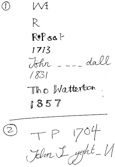
Line 2: “John”, whose surname is almost impossible to decide upon. The initial letter could be S, L or T. After some indecipherable letters, appears a group that appears to be “yght” of “yghd”, then another letter that is impossible to read, followed by “ll” (although the double “l” seem to be joined oddly, forming something that looks more like the mirror-image of a capital “N”. The curator agrees that this line of text is visible, but the museum had not previously recorded it in their description of the badge.
I enclose my plan of what I could see [see left] – this should help you visualize it, but beware – my depiction of the lettering is very much my own handwriting and was intended to jog my memory only. It is certainly NOT an exact copy of the style of engraving on the actual badges.
Some of the names might be Sergeants-at-Mace, not Waits. We do not (yet) know when Newark Waits were disbanded or when the Sergeants-at-Mace started wearing the Wait’s badges.
I suspect that these were sleeve badges. They each have three loops/holes – one at each top corner of the shield and one at its point, which could have been used to stitch the badges onto coat sleeves. The thin chains that they are currently suspended from appear to be a later method of wearing them.
To my eye, the badges look as if they are from the same date/same maker, as the way that the design is depicted, it’s proportions etc, are identical. The badges are (almost) 11cm x 9cm.
I think Jewitt and Hope have dated these Newark badges incorrectly. They mention the earliest date as being 1713 I think that the fact that one of the badges has a clear “1704” scratched into it, puts their date of 1713 into doubt. The fact that the badges bear these dates is not a reliable method of discovering when they were first made. They could easily have been in existence for some years before the first inscription was made. The dates might even refer to replating or refurbishment of some kind, which means names and initials could be the silversmith’s not those of the wearers.
We are grateful to Newark Town Hall Museum for granting us permission to photograph the badges and publish those pictures here.
Here’s a colour graphic of the town’s arms with a description too. It gives a clearer idea that the thing in between the Fleur-de-lis and the lion is actually a bird. I think my photos make it appear to be a sheaf of corn in a certain light!
www.civicheraldry.co.uk/notts.html
Al Garrod